I work with designers to incorporate layouts into a responsive website. I am often asked to create a new feature or to troubleshoot an old one.


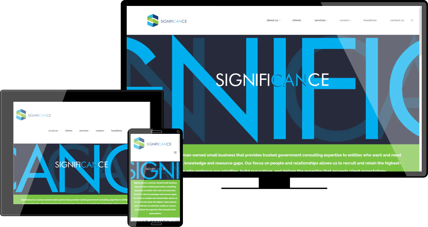
The first site using a modern, full-width format with large images and limited text.

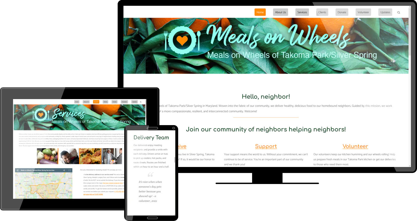
 Volunteers were using a printed map to determine if a new client was within their service area. I did a test using Google Map regions, and it was immediately used. What started as a simple test resulted in one of the most valuable features on the website.

 Building this extremely customized website with lots of special features was like taking an advanced course in modern web styling. It pushed both the designer and myself to learn and figure out many new things. The lessons learned on this website are being used for every succeeding site we build.

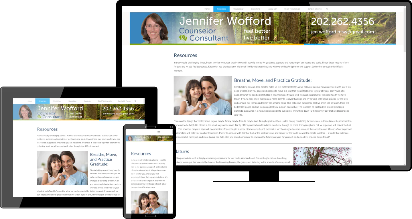
 This website was built before the Gutenberg WordPress Editor matured. Creating multiple columns required me to write many lines of custom CSS code. Because I updated the website's style using the latest CSS3 techniques, the look of this website continues to live on regardless of changing technology. This website is a good example of the promise of CSS, and separating style from HTML markup.

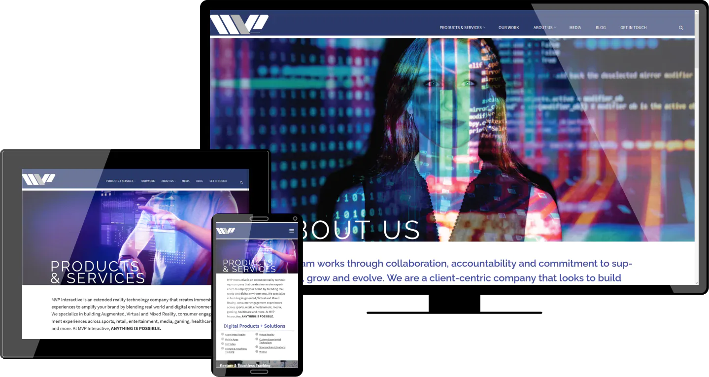
As this site went live, we had a 10Mb MPEG-4 video playing on the home page. It took only 3 days to bring the server down as the bandwidth exceeded what was allowed. Acting quickly, I converted the home page animation to vectors using Lottie for the first time. The result is indistuishable from the original video, but now has the beauty of infinite resolution and extremely low bandwidth usage.